RadSplitter
RadSplitter also creates separate regions for displaying content to users. Unlike
RadWindow and RadDock, however, the content regions that RadSplitter uses are not
pop-up windows. Instead, they are resizable frames, called panes, that divide up
a region of the Web page. The splitter can be configured to lay out its panes either
horizontally or vertically. By adding split bars between the panes, you can enable
the user to resize panes in the browser. Alternately, you can leave out the split
bars, to create a static layout of separate panes on your Web page. In a splitter
that contains split bars, individual panes can be "locked", so that they are not
resizable along with the other panes of the splitter.
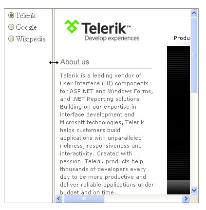
Panes can display content from an external URL, like RadWindow, or content that
is loaded with the Web page, like RadDock. The screenshot below shows a splitter
that displays a radio button list that is loaded with the Web page in the left pane,
and content from an external Web site in the right pane:
Panes that load their content with the Web page can hold any HTML elements, even
another splitter. By nesting splitters with alternating horizontal and vertical
orientations, you can create arbitrarily complex layouts.

RadSlidingZone
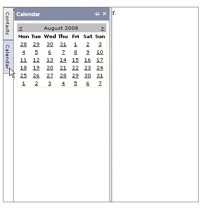
RadSlidingZone is a specialized control for optimizing layout that can only be placed
directly inside the pane of a splitter. RadSlidingZone implements a set of tabs
that can be used to slide out additional panes, called sliding panes, similar to
the way Visual Studio lets you slide out panels such as the Properties Window or
Solution Explorer. Like the sliding panels in Visual Studio, the sliding panes of
a RadSlidingZone control can be docked in place by the user. By defining sliding
panes in a sliding zone container, you can initially hide content that your users
do not need to see all the time.

You can configure the orientation of the sliding zone and whether sliding panes
expand when the user moves the mouse over their tabs or whether the user must click
on a tab to expand it. Individual tabs can be configured to display text, an icon,
or both. Sliding panes can be fixed in size, or resizable in the direction that
they expand. You can also suppress the ability of the user to dock individual sliding
panes.
Getting Started
In this walk-through you will become familiar with the following "real estate" controls:
-
RadDockZone and RadDock
-
RadSplitter, RadPane, and RadSplitBar
-
RadWindowManager and RadWindow
These controls will be used to generate the layout shown in the following screen
shot:
Set up the project structure
- Create a new ASP.NET Web Application.
- Drag a ScriptManager from the Tool Box onto the Web page.
Add the RadSplitter controls
-
Drag a RadSplitter control from the Tool Box onto the right-hand
cell of the table.
-
Using the Smart Tag, set its Skin property to "Outlook".
-
Using the Properties Window, set the Orientation property to "Horizontal"
and the Width to "100%"
-
Drag a RadPane control from the Tool Box onto the surface of the
RadSplitter. Set its Height property to "75px".
-
Drag a LinkButton from the Tool Box onto the surface of the RadPane
control. Set its Text property to "Telerik".
-
Hit the Enter key to add a line break after the link button, and
add a second LinkButton below the first. Set this one's Text
property to "Google".
-
Hit the Enter key again and add a third LinkButton.
Set its Text property to "Wikipedia".
-
Drag a RadSplitBar control from the Tool Box onto the surface of
the RadSplitter, below the RadPane you just filled. This can be a little tricky,
so feel free to use the Source view to move it into place if you need to.
-
Drag a second RadPane control onto the RadSplitter. Once again,
this can be a bit tricky, so check in the Source view to make sure that it landed
in the right place. At this point, your RadSplitter declaration should look like
the following:
[ASP.NET] RadSplitter declaration
<
telerik:RadSplitter
ID
=
"RadSplitter2"
runat
=
"server"
Orientation
=
"Horizontal"
Skin
=
"Outlook"
Width
=
"100%"
>
<
telerik:RadPane
ID
=
"RadPane2"
runat
=
"server"
Height
=
"75px"
>
<
asp:linkbutton
id
=
"LinkButton1"
runat
=
"server"
>Telerik</
asp:linkbutton
>
<
br
/>
<
asp:linkbutton
id
=
"LinkButton2"
runat
=
"server"
>Google</
asp:linkbutton
>
<
br
/>
<
asp:linkbutton
id
=
"LinkButton3"
runat
=
"server"
>Wikipedia</
asp:linkbutton
>
</
telerik:RadPane
>
<
telerik:RadSplitBar
ID
=
"RadSplitBar3"
runat
=
"server"
/>
<
telerik:RadPane
ID
=
"RadPane3"
runat
=
"server"
>
</
telerik:RadPane
>
</
telerik:RadSplitter
>
Add the RadWindowManager and RadWindow controls
-
Drag a RadWindowManager control from the Tool Box and place it
at the bottom of the Web page.
-
Using the Properties Window, set the Skin property to "Outlook".
-
Press the ellipsis button next to the Windows property to bring
up the RadWindow Collection Editor.
-
In the Collection Editor, click the Add button to add a
RadWindow
to the RadWindowManager's Windows collection.
-
Assign the following properties to the new window you just added:
-
Set Animation to "Fade".
-
Set Behaviors to "Resize, Minimize, Close, Maximize, Move, Reload".
-
Set OpenerElementID to "LinkButton1".
-
Set Title to "Telerik".
-
Set VisibleStatusBar to false.
-
Set NavigateUrl to "http://www.telerik.com". As before, be sure
to include the entire URL.
-
Click the Add button again to add a second RadWindow to the collection. Set the
following properties:
-
Set Animation to "FlyIn".
-
Set Behaviors to "Resize, Minimize, Close, Maximize, Move, Reload".
-
Set OpenerElementID to "LinkButton2".
-
Set Title to "Google".
-
Set VisibleStatusBar to false.
-
Set NavigateUrl to "http://www.google.com".
-
Click the Add button again to add a third RadWindow to the collection. Set the following
properties:
-
Set Animation to "Resize".
-
Set Behaviors to "Resize, Minimize, Close, Maximize, Move, Reload".
-
Set OpenerElementID to "LinkButton3".
-
Set Title to "Wikipedia".
-
Set VisibleStatusBar to false.
-
Set NavigateUrl to "http://www.wikipedia.org".
- Click Ok to exit the collection editor.